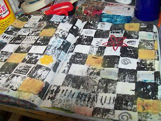
If you look at the page featured in today's post, you'll see that the style is a little more streamlined than most of my other pages - most of the ones that I do on a regular basis are a more grungy, distressed feeling page, while the page that I'm showcasing today is quite different. Sure it's got a few of those things, but there's a lot more straight, planned lines, with my style inside of them. I actually created this page as a challenge page. Over on Ky's blog, she told us that our challenge was to showcase a checkerboard. A lot of times, at least for me, when I'm told something like that, an idea normally pops into my head, and I feel that it's my responsibility to put it on paper. So I got an idea, and I just decided that I'd go with it, whether I felt like it or not. But a lot of times when I get such an idea, I automatically go crazy - I feel it's my duty to let it free, and it's me holding such a wonderful idea from sprouting.
Another note about using a different style every now and again in your art journals is that it gives you a new feeling of accomplishment - and if you always do the same kind of pages, then it gives you the feeling that you actually can do something other than what's in the zone that you are comfortable with. And when you learn this; that you can do it, and that you can take it to the next level. So go out of your comfort zone today - do a page idea that you've had in your mind for a while now, but have been afraid to use. Trust me. I know.
Oh, I really like your checkerboard design! Very cool! Always fun to try new things, isn't it!?! And I always think it is great to use what you have on hand. You are so creative...loving your art!
ReplyDeleteHey Jordan, I love your checkerboard....great minds think alike, I used the same idea for my entry for this challenge!
ReplyDeleteI love those checkerboards too!
ReplyDeleteGreat journal spread. I agree, we are often too much in our comfort zones! I really like what you have accomplished here!
ReplyDeleteI love all the texture and color you have worked into this overall B&W scheme! Wonderful interpretation of the challenge. Thanks so much for playing along with Oh, Alice!
ReplyDeleteGreat Idea! I like the checkerboard. Might try it out myself.
ReplyDeleteI like this page very much, reminds me of the kind of stuff Michelle Ward used to do in Somerset Studios, fab.
ReplyDeleteAnd like other commenters, I can't believe how articulate you are at the age of 13! wow!
Great pages!!
ReplyDeleteGlad I found you through the miz kate dot com Artist blog hop!
I am your newest blog follower. :)
Looking forward to seeing your upcoming posts!
I welcome you to check out my art blog, too!
Best,
Mary C. Nasser
http://www.marycnasser.com/blog.html
Hi! I'm looking for inspiration for the second issue of my magazine. You can see the number 1 in www.nuskinadiary.blogspot.com and you tell me if you want me to write about your blog;)
ReplyDeletesorry for my English
greetings